



A micro interaction is a small, single-purpose moment in a digital product where the interface responds to something you do, such as a heart filling when you like a post or a password field turning red when it is too short. Micro-interactions give instant feedback, show system status and guide users, so a product feels clear and responsive.
Although most of the time we don’t even pay attention to them, micro-interactions penetrate our digital life. Every day, from the minute we open our eyes until we check to see if our friend has sent a message, we engage in countless micro-interactions. They’re crucial to a user flow’s success because of the impact they have on the whole experience.
Taking micro-interactions into account is essential for a UI/UX design agency. After all, making users happy is a top priority, and what better way to do that than by adding small dynamic elements and fun things to do throughout the product?
Learn more about the significance of micro-interactions and how they enhance UX and Interaction Design by reading this blog.
Key takeaways
- A micro interaction is a small, single-purpose response to a user action or system event, such as a like button filling with colour.
- Dan Saffer's model splits every micro-interaction into a trigger, rules, feedback, and loops and modes.
- Good micro-interactions confirm actions, show system status, prevent errors and guide users to the next step.
- Keep them short and subtle; simple feedback such as a toggle should feel instant.
- Respect reduced-motion settings and never use colour alone to signal success or an error.
What Are Micro-Interactions?
Micro-interactions are small moments of user engagement with a product’s interface. Mini, ideally practical animations that aid the user by communicating changes more clearly and providing visual feedback. Their job is to tell users what is happening and confirm that an action worked, without getting in the way.
Micro-interactions allow for nonverbal exchange of information. The fireworks after an activity is completed and the loading bar indicating its progress are both examples of micro-interactions.

Micro-interactions include anything from swiping, scrolling, clicking, hovering, liking, sharing, and saving to adjusting the volume and muted/unmuted settings on your phone.
Why Are Micro-Interactions Important?
The primary significance of micro-interactions lies in the fact that they are designed exclusively with the end user in mind. Businesses that make their clients feel like they are number one are more likely to have loyal customers.
Our focus as designers and developers tends to stray from the ultimate purpose of a product, which is to encourage regular use by its target audience.
Improve Usability: Microinteractions are crucial because they improve usability and the user experience by giving users instantaneous feedback. A user’s successful action is signaled visually when an animation plays after they click a button.
The same holds true for error messages; if a user sees one, they know exactly what went wrong and can fix it.

Emotional Connection: Microinteractions can also be used to make the consumer feel more connected to the product. For instance, an amusing animation or sound effect can make you happy, whereas an annoying error notice can make you angry.
Users’ perceptions of the product and their level of happiness with it may be affected by the emotional connections they have with it.
Guide users: Microinteractions can also be used to help direct customers while they use a service or product. They can show users what to do next or what information they need to enter visually. With the right direction, users are more likely to succeed in their tasks and keep coming back for more.

Promote Sharing: They inspire people to talk about, like, and comment on your posts.
What Makes a Good Micro-Interaction?
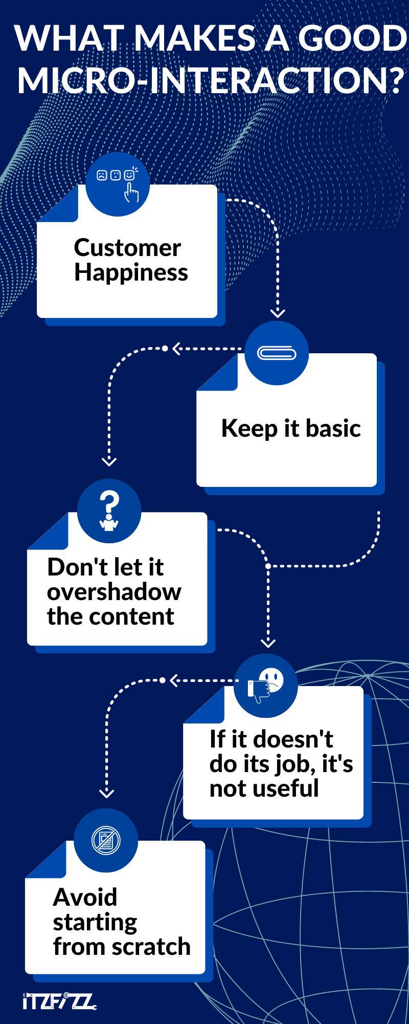
The key to a good micro-interaction is making sure it doesn’t steal the show from everything else. It needs to be subtle, fleeting, and eventually disappear.
Users favour functionality over design, even when micro-interactions are entertaining and interesting. That’s why it’s important for micro-interactions to be snappy moments of functionality meeting design for the benefit of the user.
There are three main functions that micro-interactions need to fulfil:
- Improve usability and add some fun to the functionality.
- Instill in the customer a sense that they are in command of the product
- Facilitate communication between the design and the user.
Customer Happiness: As we’ve already established, it’s always about the consumers, and that includes the tiniest interactions. Therefore, UI/UX firms need to test and evaluate ideas for micro-interactions to make sure they work properly and don’t detract from the overall user experience.
Keep it basic: Do not overcomplicate micro-interactions; their primary purpose is to improve the user experience and make the product easier to use. Make them straightforward, formal, and lighthearted instead.
Don’t let it overshadow the content: If the website or app is not the actual product, this becomes much more crucial to remember. People are more interested in the interaction than in the product itself when the interaction dominates the experience.
This kind of buzz isn’t sustainable because it doesn’t keep users glued to your site or app, and it can have a detrimental impact on your offering in the long run.
If it doesn’t do its job, it’s not useful: The interactions at the smallest scale must serve a purpose and enhance the product. Don’t add pretty things to it just because you can. Only maintain essential connections and strive to make them more efficient.
Avoid starting from scratch: Users have developed preferences for particular interactions. Redesigning or replacing them could cause annoyance or dissatisfaction among users.
Be careful not to drastically alter a previously established pattern of communication, but rather to introduce subtle alterations that will not alter the nature of the engagement as a whole.
What Are the Four Parts of a Micro-Interaction?
Designer Dan Saffer, author of the 2014 book Microinteractions, broke every micro-interaction into four parts: a trigger, rules, feedback, and loops and modes. Nielsen Norman Group describes the core even more simply, as a trigger paired with a feedback response. Here is what each part does:
Trigger: Microinteraction begins with the trigger. Either the user or the system can set them off. The actions of the user, such as clicking, swiping, pushing a button, or scrolling, might serve as a trigger.
When certain conditions are satisfied, the system may decide to display a notification, pop-up, or animation as part of a system-initiated trigger.

Rule: After a user or system initiates a micro-interaction, the rule decides what comes next. What happens when a user taps an icon? Does an animation play? Is the user logged out?
Any rules implemented must make sense to the end user. A user’s expectations for what happens when they tap the flashlight app icon are quite straightforward. Microinteractions triggered by a system are subject to the same regulation.
Feedback: The feedback sent to the user during a micro-interaction is essential for keeping them informed. Payment processing with inline validation is a great example of user input.
Users are immediately alerted to errors when inline validation is used. For instance, if someone entered an invalid credit card number.

Loops and Modes: The loops and modes that emerge from frequent use define the underlying laws that govern micro-interactions. A good example is the on/off switch of a time-tracking app.
A user can monitor the beginning of a session by toggling the switch between its “on” and “off” positions.

Micro-Interaction Examples, Broken Down
Seeing the four parts in familiar products makes them easier to design. Here is how six everyday micro-interactions break down:
| Example | Trigger | Rule | Feedback |
|---|---|---|---|
| Like button on a social post | User taps the heart | The like is saved and the count goes up | Heart fills with colour and briefly pops |
| Pull to refresh | User drags the feed down | App checks for new posts | Spinner appears, then new posts slide in |
| Password strength meter | User types a password | Password is checked against the rules | Bar changes colour and hints update |
| Add to cart | User clicks the button | Item is added to the basket | Button reads Added and the cart badge count rises |
| Dark mode toggle | User taps the switch | Theme setting changes and is saved | Switch slides and the interface changes colour |
| Inline form validation | System checks a field when the user leaves it | Entry is checked for errors | Message appears next to the field before submitting |
Keep them accessible. Short and subtle beats long and showy. Respect the prefers-reduced-motion setting for people who ask their device for less movement, and never rely on colour alone to signal success or an error. The WCAG use of colour rule asks for a second cue, such as text or an icon, so people with colour vision deficiency still get the message.
When Should You Use Micro-Interactions?
Despite their diminutive size, micro-interactions are hailed as the UX/UI industry’s secret weapon when it comes to conveying information to users:
Swipe: Swiping instead of tapping is a more natural and intuitive way to interact with a device. To learn more about the product, the consumer can easily navigate across tabs.

Data Input: We’ve all experienced the annoyance of having to create a password or an account. This would likely set off some alarm bells.
User progress is facilitated by proactive suggestions regarding password strength and usage, user engagement is maintained and progress is made through the use of interactive interactions during the data entry process.
Animations: Microinteractions are made possible and enhanced through animation. They are the embodiment of thoughtful design; while their presence is often taken for granted, their absence is felt keenly.

They’re the glue that enables designers to turn mundane tasks into pleasurable, even addicting experiences.
Current System Status: It is crucial to update users on any changes made to a site or app. Without proper context, consumers are more likely to become frustrated and abandon the site or service. With the help of these tiny interactions, the user is kept fully apprised of what’s happening and how much longer the procedure will take.

Make Tutorials: Each and every one of us is perpetually on the lookout for new knowledge. Microinteractions are used in tutorials to assist users in learning how an application works by drawing attention to the most fundamental elements.
Call to Action: Microinteractions are little, subtle changes that can have a big impact on how often a user engages with a website or app. The greatest strategy to get users to respond to your call to action is to make it interesting to them, as this triggers positive emotions and motivates them to take action.

Animated Buttons: They facilitate the user’s experience by explaining how to navigate your app or website, which makes them one of the basic web design elements worth getting right. To ensure a smooth journey for the user, we must pay close attention to every detail, including colour, shape, special effects, animations, location, and texture.
How Do You Design Micro-Interactions?
Designers get a kick out of creating micro-interactions since it gives them a chance to try out novel design solutions and seek innovative methods to surprise people. But there are several things to keep in mind while doing so:
- Put yourself in the user’s position and use all available information to learn how they interact with your app.
- Make animations that serve a purpose. Animations that not only look good but also do something useful for the user.
- Have some fun and make your users smile. What people experience while interacting with the app is the driving force behind their continued use, and they are more likely to return after a positive experience.
- Don’t be a bother. Users are put off by an abundance of animations. If your app is annoying to use, people will stop using it.
- Don’t go too technical; stick to plain English. Friendly, clear microcopy can make an empty or error screen far less frustrating.
Best Practices for Designing Micro-Interactions
The five best methods for creating effective micro-interactions are as follows:
Construct a Habit Loop: Make a routine out of a series of steps that the user will perform repeatedly. This routine develops as a result of the customer’s consistent use of the product.
On Facebook, for instance, users can view responses to their postings by clicking the notification button. In this case, the reward is the activities of those who follow you, thus clicking the notification icon becomes a habit.
Extreme Functionality: The product’s micro-interactions need to be highly practical and functional.
Automatic Reaction: Microinteractions’ reactions to the user’s activities should come through naturally. An excellent example of this is Gmail’s ability to produce answers to emails based on their content.
Drag and Drop: Several user-required procedures have been rendered unnecessary thanks to the drag-and-drop paradigm. Furthermore, it is a typical micro-interaction in modern websites and apps because it is straightforward and easy to grasp.
Swiping Fun: The swiping action is a perfect example of a simple, straightforward, fast, and enjoyable micro-interaction. It can also form looping habits, which are highly addictive.
Which Tools Can You Use to Design Micro-Interactions?
So, which prototyping tools do you recommend designers learn? There are a lot of options for accomplishing micro-interaction activities, but not everyone is familiar with the finest ones. Based on our expertise in designing these components, we’ve compiled the following suggestions:
For those who have some experience with computer code:
Mobile: Xcode, Android studio
Mobile or Web: Framer
Web: CSS animation
For designers who prefer visual tools, Figma prototypes can animate between screens with Smart Animate, ProtoPie handles more complex interactive prototypes, and Rive or Lottie files let you hand developers lightweight animations they can ship in apps and websites. Our roundup of design tools covers more options.
Conclusion
Micro-interactions, as you can see, are pervasive and play a crucial role in the overall user experience. Micro-interactions provide feedback to the user about upcoming or current events. For this reason, care should be taken when designing micro-interactions by keeping in mind the aforementioned guidelines.
Given the breadth of the topic, we could only scratch the surface here. Our intention with this piece was to highlight the significance of these elements in all digital products. As a design agency, we place great importance on detail. At Itzfizz Digital we deliver carefully crafted micro-interactions.
The importance of micro-interactions will increase as we go into a future where technology is always developing. In order to remain competitive and maintain customer loyalty, businesses, and organisations will need to adopt new trends and implement new micro-interactions.