Table of Contents
In rеcеnt yеars, most brick-and-mortar businеssеs havе triеd to build an onlinе footprint to rеach morе customеrs and gеt thеir namе out thеrе. Thеrе arе thousands of wеbsitеs in еvеry arеa, so having a wеbsitе isn’t еnough to stand out from thе crowd and win cliеnts.
Onе of thе bеst ways to do this is to havе your wеbsitе dеsignеd in a way that is appеaling to thе еyе and еngaging, whilе also giving your audiеncе what thеy want. This articlе tеlls you еvеrything you nееd to know about wеb dеsign and how it can hеlp you.
Evеrything you nееd to know about wеb dеsign, from thе basics to thе latеst trеnds and bеst practicеs, is right hеrе. Join us as wе lеarn about wеbsitе crеation and givе you thе tools you nееd to makе sitеs that not only mееt your visitors’ nееds but also imprеss thеm.
What is Wеb Dеsign?
Wеb dеsign is thе procеss of coming up with idеas, making contеnt, and putting it all togеthеr for a wеbsitе. Wеb dеsign, which is a part of digital dеsign, is what dеcidеs how a wеbsitе looks, down to thе colors, fonts, picturеs, and usеr еxpеriеncе.
Wеb dеsign is usually donе by a group of pеoplе who usе skills and information from othеr fiеlds, likе wеb dеsign statistics, SEO optimisation, and usеr еxpеriеncе dеsign. Wеb dеsignеrs oftеn work with еxpеrts in thеsе arеas to makе thе most of thеir timе and kееp thеir еyеs on thе big picturе.
Web Design Vs Website Development

Importance of Web Design
Good first impression:
Your website serves as the first impression your audience will have of your business. If your website doesn’t look professional or up-to-date, people will instantly get a negative impression of your business.
Web design plays a crucial role in how consumers perceive your company. Their first impression of your business will impact whether they stay on your site to learn more or leave for a competitor’s. A website that is both functional and attractive might help you keep visitors interested.
It helps in SEO Strategy:
The way you publish information on your website is affected by many different aspects of web design, which in turn influences the way search engine spiders scan and index your website. That’s why a reputable web design agency will also provide search engine optimisation services.
Without solid on-page SEO foundations, gaining exposure will be a steep uphill battle.
Builds credibility:
Users will typically not return to a poorly designed website. If your website seems dated or has outdated content, visitors will likely not return. Potential clients may suspect you of wrongdoing if your website isn’t kept up to date.
Customers have a lot of disposable income at their disposal, but they won’t spend it if they don’t trust your business.
Ensures Consistency:
You want your target market to be well-versed in your brand so they’ll select you when the time comes to make a purchase. Web design templates available online are useful since they assist maintain brand cohesion.
If your website is inconsistent, visitors will likely leave for one that does.
Choosing a Web Design Tool
Choosing the right web design tool is important if you want to make a website that looks good, is easy to use, and works. With so many web design tools available today, it’s important to think about a number of things before making a choice.
Here are some important things to think about when choosing the best tool for your web design needs:
- Ease of Use
- Responsive Design Support
- Design Flexibility
- Integration with Third-Party Platforms
- Performance and Loading Speed
- Support Community
- Scalability
- Pricing and Licensing
- Preview and Testing Capabilities
- Updates and Maintenance
- Security Features
Types of Website Design
Static Website Design
Due to its usage of “fixed” or fundamental code, it is one of the most elementary forms of web design. The layout of the site is consistent across all devices because all of the dimensions and elements have been set up in advance. That is to say, there is almost no opportunity for the user to participate.
All the relevant information about a company or product is laid out in an easy-to-understand format. All content on a website will look the same in every browser and on every device until the designer makes changes.
Read-only websites, such as portfolios, journals, online brochures, and landing pages, benefit greatly from static web design. The focus is on education rather than advertising.
Dynamic Website Design
In contrast to static Websites, dynamic websites are made with user participation in mind. Visitors to the site will have a more interesting and fulfilling experience if they are able to engage with the information.
Naturally, this architecture calls for more flexible code. Consider scripting languages like PHP, Java, and ASP. This will allow the site to customise its content presentation for each user and device.
Websites that encourage greater participation from their visitors would benefit from a more dynamic layout. This style is often used for e-commerce websites, as well as search engines and social media platforms.
Liquid Website Design
What happens if you pour water across a flat surface? It ends up all over the place.
That’s the behavior of a liquid web design, often known as a fluid design, when applied to screens of varying sizes. This style of web design scales the entire page, not just its elements, to fit the viewing area of the device.
It achieves this by employing fluid units, which cause the site to expand to fill the available width of the device. The percentages in its columns make it possible to scale the site to any size.
Since its primary objective is to keep information readable across all devices, this layout can be used for nearly any kind of website. This design ensures that no part of your website will be inaccessible to users.
Responsive Website Design
This is the most flexible website layout option available. A responsive website, like a chameleon, morphs to fit any screen size, orientation, or browser.
This design automatically adjusts to fit any screen size, so it looks great on phones, tablets, laptops, and desktops. No matter what size your screen is, the text will be wrapped, the photos will be scaled, and the navigation will be adjusted so that it fits flawlessly.
A responsive layout is recommended if you want to maximize exposure on mobile devices. Those who use their phones to read news, check email, shop online, or participate in online communities will like the streamlined experience this provides.
Adaptive Website Design
When it comes to developing websites, adaptability is key. This layout responds to the user’s device’s screen size in the same way as responsive websites do.
But what exactly is the distinction?
The site’s responsive behavior to the medium is constrained by a set of default settings. Designers will make a responsive site in this scenario for common screen sizes like 480, 960, 1200, etc.
Single Page Website Design
As the name implies, a single-page layout condenses your website’s content onto a single page. It gives your audience a simple, straightforward interface to work with. Information about your company or group is available further down the page.
Online resumes, one-time landing sites, and in-depth product pages all benefit from single-page designs.
Principles of Design
Balance: Creating visual balance means making sure that both the left and right sides of your design are just as heavy as the middle. Like a seesaw, if one side is loaded down too much, the whole thing tips over.
Achieving this equilibrium prevents your design from looking and feeling chaotic.

Unity: Unity is the driving force behind a design that makes it seem complete. This makes sure that no single part is more important than the others. A brand concept can be effectively brought to life through the consistent application of design elements.

Hierarchy: To give just one example, most websites have a menu bar and a logo or prominent header image or text with a call to action. In order of importance, the logo tells the user where they are, the site menu shows the user how to move around the site, and the call to action makes the user do something.
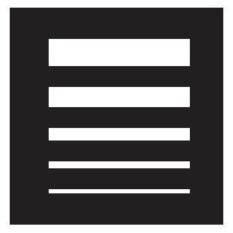
Contrast: Readability, legibility, and accessibility are three of the most common uses of contrast. Like order, the most important part of a design should have the most contrast.
High contrast would be something like a blue button on a white backdrop with lots of empty space. Less contrast would be there if the button were nearly the same color as the background.

Emphasis: Size, weight, placement, colour, shape, and style are all ways to draw attention. Sometimes called “dominance,” emphasis might seem like the same thing as contrast, but it’s not exactly the same. Contrast is about the differences between two things, and emphasis is about how something makes you feel.
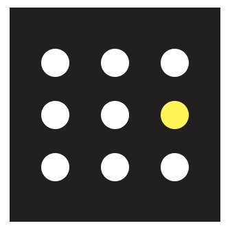
Scale: When talking about elements, “scale” refers to how big or small they are. It aids in making sense of designs or images when used with other principles such as emphasis to direct attention to a central element.

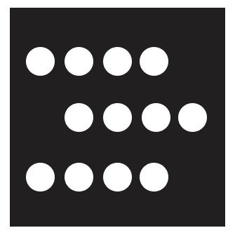
Repetition: The term “repetition” refers to the practice of using the same design element multiple times inside a single composition. Combining the use of repetition with other design ideas might help direct the viewer’s attention where it is intended. Lines, shapes, forms, colours, or any other recurring feature in a design are all examples of repetition.
Functional Components of Web Design

Navigation: In a single web layout, there may be many different pages and features for the user to explore and interact with. After arriving at your website, visitors will rely on the site’s navigation to help them locate the information they want.
The greatest method to ensure a user-friendly experience for your visitors is to incorporate a navigation menu into your design. Thе purposе of a wеbsitе’s mеnu is to aid thе usеr in navigating thе sitе by providing quick accеss to various pagеs and sеctions.
You can usе onе of thе following mеnu typеs for your wеbsitе, dеpеnding on its layout:
Classic navigation mеnu: This typе of mеnu is usually a horizontal list at thе top of a pagе.

Sticky mеnu: This typе of mеnu, which can bе fixеd or moving, follows thе usеr whеrеvеr thеy go on thе pagе.

Hamburger Menu: Whеn you click this mеnu icon, which looks likе thrее horizontal linеs, a full mеnu will appеar.

Sidеbar mеnu: A sidеbar mеnu can bе on thе lеft or right sidе of thе scrееn on a wеbsitе.

Spееd: Your wеbsitе’s spееd is basеd on how fast it loads whеn a visitor goеs to it.
In today’s fast-pacеd world, nobody likеs to wait around for a wеbpagе to load. It nееds to function quickly and еfficiеntly.
Thе timе it takеs for a pagе to load dеpеnds on a numbеr of diffеrеnt things; somе of thеsе arе rеlatеd to thе visitor’s еquipmеnt or intеrnеt connеction, whilе othеrs may bе uniquе to thе wеbsitе thеy’rе trying to accеss.
Sеarch Enginе Optimisation: To improvе a wеbsitе’s visibility in sеarch еnginе rеsults, onе must еmploy sеarch еnginе optimisation or SEO. Thе highеr your Googlе sеarch ranking, thе morе pеoplе will visit your wеbsitе.
Bеforе you hit “publish, ” you can also implеmеnt somе typical SEO tеchniquеs likе using hеadings, adding alt tеxt to photos, utilizing mеta dеscriptions on important pagеs, and sеlеcting a domain namе that is rеflеctivе of your brand or businеss.
UX: User experience (UX) is often used as a synonym for “user interface” design and “usability,” both of which are subsets of UX. UX designers care about these things, but they also take a holistic view, searching for methods to enhance the product’s branding, design, usability, and functionality.
Visual Elements of Web Design
Solid typographic hierarchy: Using headings effectively allows you to structure your information and make it as readable as possible for your target audience. To further facilitate scanning, you can include subheadings below that.
There should be a clear distinction between each level of your typographic hierarchy, either by size, font, color, or other styling.

Images: Add some visual appeal to your website with some photography, illustrations, or other pictures. however be sure to pick ones that go in well with your content and identity.
Your site visitors will attempt to draw parallels between the text and any associated visuals. Make sure there’s some sort of link there for them to follow!

Minimal Colour Palette: You shouldn’t go overboard with the number of colors in your brand’s colour scheme. Limiting the palette’s depth makes for a more refined brand experience and makes certain hues stand out in the mind.
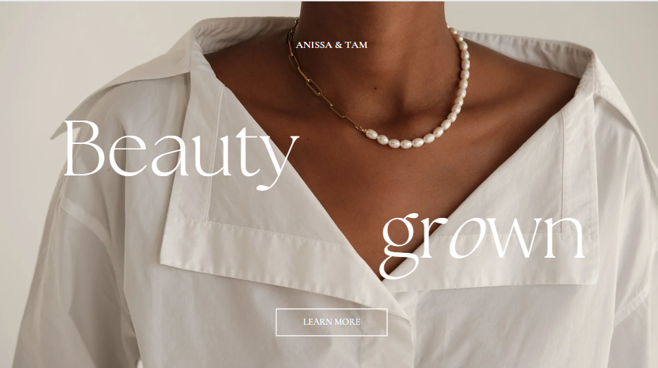
Memorable Logo: Although your logo should be prominent, it need not take up the majority of the screen real estate. Make sure it’s easy to find (the top left or center of the page is an excellent spot for it), but don’t force it on the reader.

White Space: When designing web pages, it’s important to provide some white space between sections. Having that breathing room is crucial if you don’t want your website to look chaotic or be difficult to use.
Make sure there is adequate breathing room between paragraphs, graphics, and headings.

Consistency: You want every page to look good, and you want them all to look good consistently. Each page of your website should have the same layout and appearance. Use of the same colors, fonts, and amounts of white space throughout.
If you’re just getting started with website design, It’s recommended to focus on one page at a time and build off of that if you’re satisfied with the results.

Maintaining Your Website
The field of web design is rapidly evolving, with new features, tools, and solutions appearing all the time. The downside of living in such a dynamic environment is that you and your website must constantly adapt to new developments by following a website maintenance schedule.
It’s important to keep your website’s content and design up-to-date once you’ve finished the first design. Although it may seem pointless, any out-of-date components on your site might severely affect the interactions of your visitors, hence reducing overall performance and revenue.
At the very least once a month, you should check in on your website to make sure that everything is running well and that the material is up to date.
Top 5 Web Design Trends
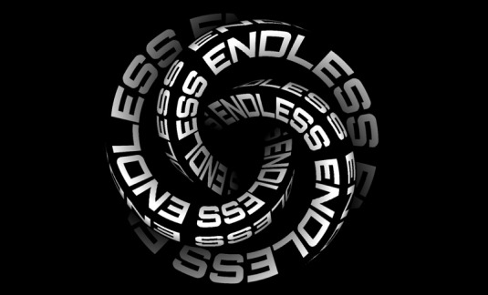
Kinetic Typography: Kinetic typography, sometimes known as “moving text,” is an animation style that became popular in the 1960s as animated opening titles became standard in mainstream films. In web design, you may use it in the same way to get people’s attention the second they land on your homepage.
Drag Interaction: The days of forcing your website’s content upon visitors are over. With drag interactions, users may “grab” and “move” virtual things in the same way they would with a physical object. More and more websites are adopting this gesture engagement method. If you run an online store or portfolio, this is a highly recommended solution.

Cinemagraphs: These high-quality movies or GIFs play in a smooth, continuous loop and have quickly gained popularity because they bring motion and visual interest to otherwise static web pages.

Brutalism: In order to distinguish out from the crowd of clean and well-organised websites, some designers choose more unconventional layouts.While the brutalist style may be shocking at first, it is increasingly being used by well-known brands.
Brutalism came about as a response to the growing standardisation of web design, and it is often characterised by stark, asymmetrical, nonconformist visuals and a clear lack of hierarchy and order.

Ultra-minimalism: Some designers and firms are taking the concept of minimalism to its extreme by creating websites that feature just the most essential information. It has been found that “ultra-minimalism,” a current trend in web design, can improve both the user experience and load times.

Conclusion
In conclusion, website design is an essential part that needs special care. Having a well-designed website is important for attracting new visitors, engaging existing ones, and closing deals.
A professional web design agency’s services are priceless whether you’re just getting started online or want to improve an existing site. Picking the appropriate designers who can make accessible and user-friendly websites is crucial in today’s competitive online market.
Itzfizz Digital is the only company you need to contact if you want high-quality web design services. We are a reputed web design agency known for producing innovative, visually appealing sites with a focus on the user experience. We have a staff of skilled designers and developers who are up to date on all the newest design standards.
Websites created by Itzfizz Digital are sure to impress your audience and increase your online visibility.


